Naming components

Guide to creating a taxonomic glossary of Design System components, properties, and values.
Nomenclatures are one of my favorite topics that I learned from building components.
Taxonomy is a very important element for design teams, as it allows them to be closer to development teams by sharing the same common language. But, where do we start? Is there a glossary? I wish there was a glossary or a manual that will help us achieve lexical consistency in our team. Component nomenclatures are a topic that is often left to the last and makes it very difficult to implement, build and maintain component libraries.
Through this article, I will try to clarify the possible doubts that usually appear when we begin to build components.
1. Identifies elements
Familiarize yourself with the elements that a component has, to know all the possibilities of nomenclatures that are available in each of them. This will help you to look for references in other systems, to create your own taxonomic system.
Components
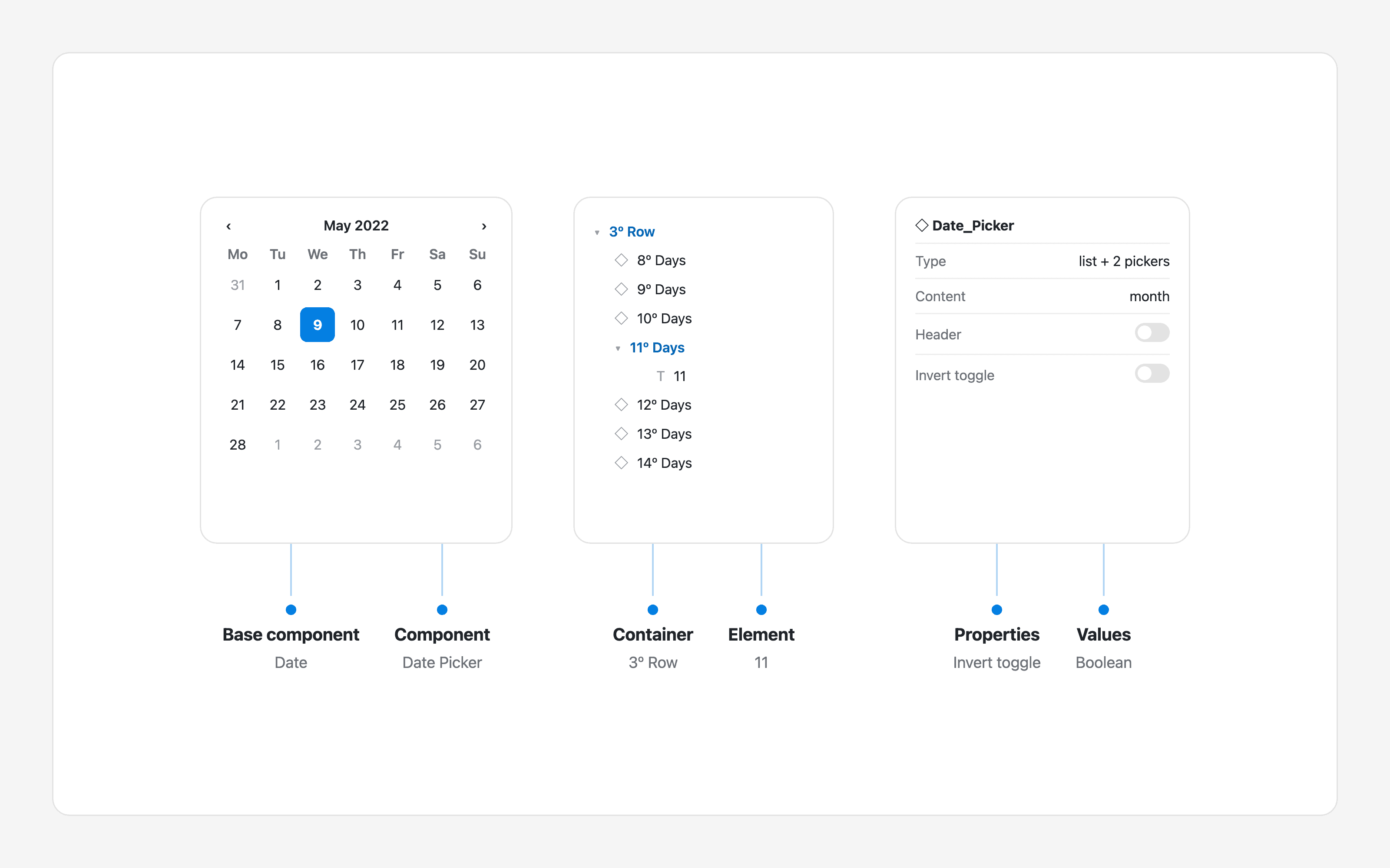
There are two types: Component and Base Component.
Component: Blocks that contain visual information and are part of the UI kit. Example: Card.
Base Component: Components designed to be used inside other components. Sometimes they are hidden in the UI kit because they are small pieces that are meaningless by themselves. Example: the numeric button used only to show the days of the month in a date picker.
Some design systems name base components as assets, snippets, parts, items, utility, or subcomponents.
Objects
These are the elements that make up a component. There are two types: Container and Element.
Container: Boxes that contain elements, such as blocks, sections, headers, footers, content, or items.
Element: Objects that contain visual information: text such as label, header, subheader, or caption; components such as icons, illustrations, buttons, or tables; vectors; and media such as video, GIF, or image.
Properties and values
Properties are the variable aspects of a component. For a button, they might include size, state, or color. Values are the different options available for each property: for example, a state can be default, hover, pressed, or disabled.
Variants: properties with more than two options.
Boolean: properties with two options, expressed as true/false, yes/no, or on/off.
2. Define structure
Once you have identified the element you want to name - components, objects, properties, and values - define the modifier and its position in the naming structure.
Type of modifier
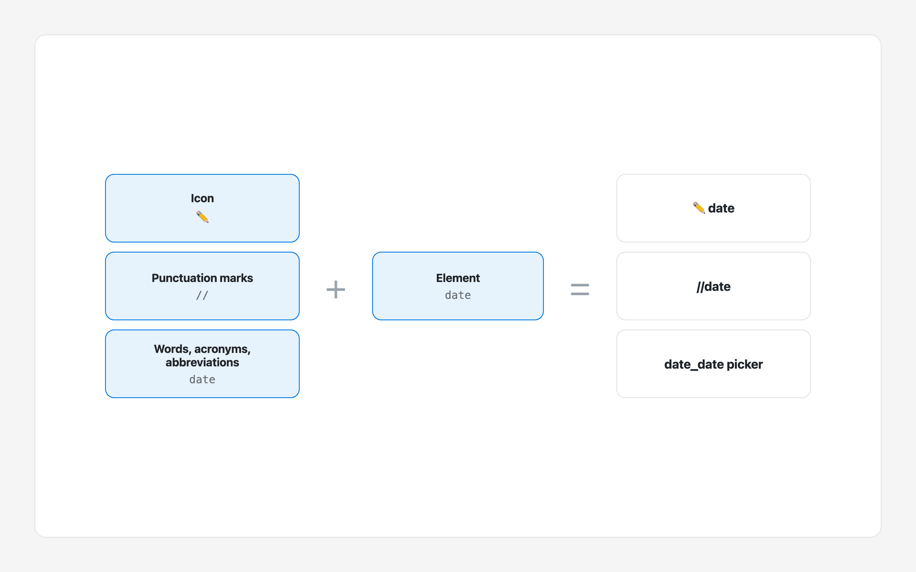
A modifier distinguishes one element from another. It can be an icon, punctuation, or words, acronyms, and abbreviations.
Icon: 💠 Button, 🔹 Table, 🚫 List - Deprecated, ✏️ Custom.
Punctuation:
._Base,//Cell-Item.Words or abbreviations:
Asset_Item-List,BC_Cell-Header,ShowIcon.
Modifier position
Choose the order that best suits your system:
Modifier + element:
Item-List.Element + modifier:
List-Item.
3. Unify grammar
When you have defined the structure of your nomenclature, unify its grammar.
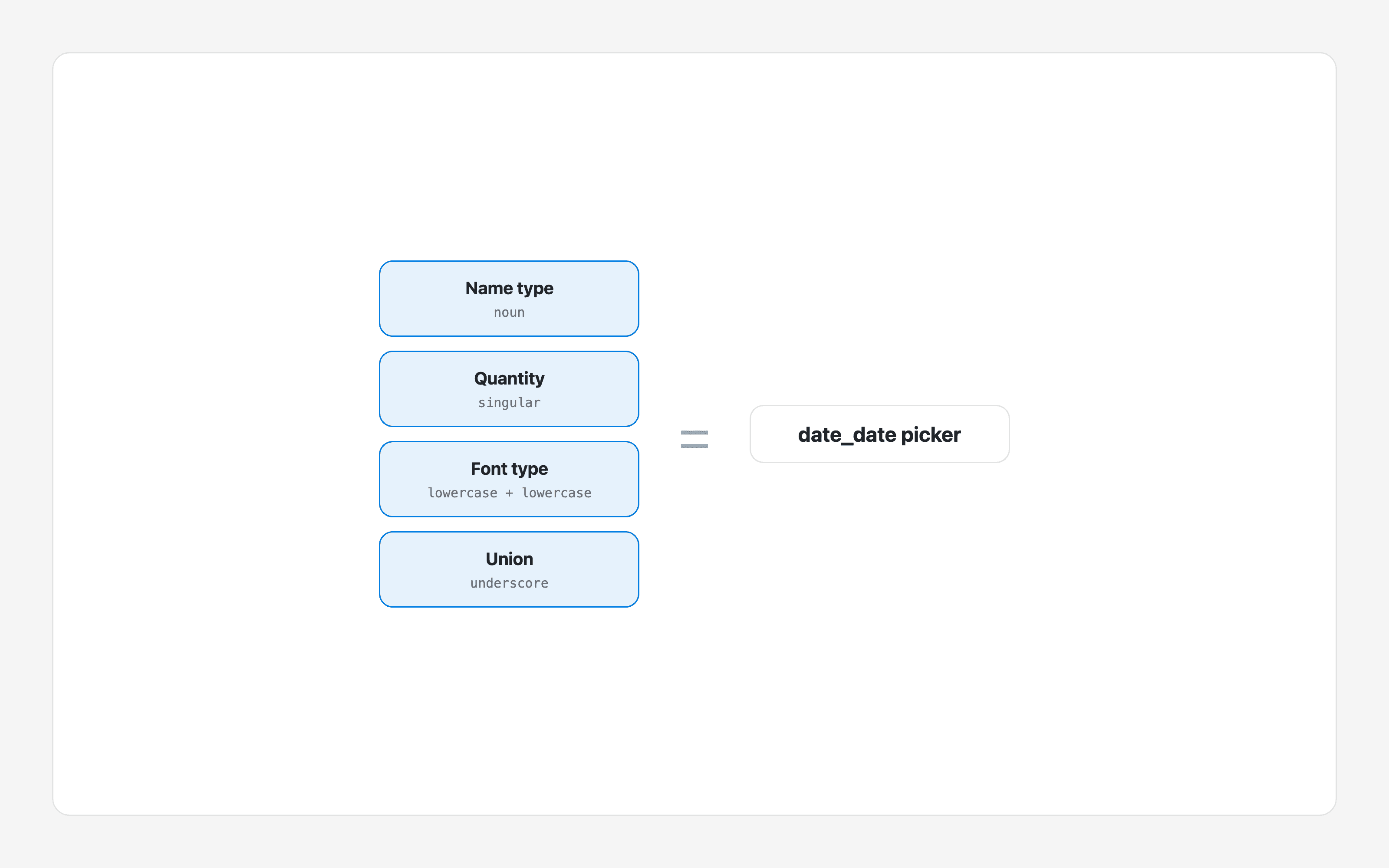
Name type
Choose a consistent type of name: past participle verb (Collapsed), present verb (Collapse), adjective (Collapsable), noun (Collapsible), verb to be + noun (Is Collapsible), verb + adjective (Show Collapsable), or noun + adjective (Icon before).
Quantity
Define whether your nouns are singular or plural and standardize the choice. Use one generic designation consistently: button, buttons, or actions.
Font type and union
Establish a readable pattern for initials: Icon Before, icon before, Icon before, or icon Before. Then choose how words join: no space (iconBefore), space (icon before), hyphen (icon-Before), or underscore (icon_Before).
In code, predefined case styles combine typeface and union: camelCase, PascalCase, kebab-case, and snake_case.
4. Organize elements
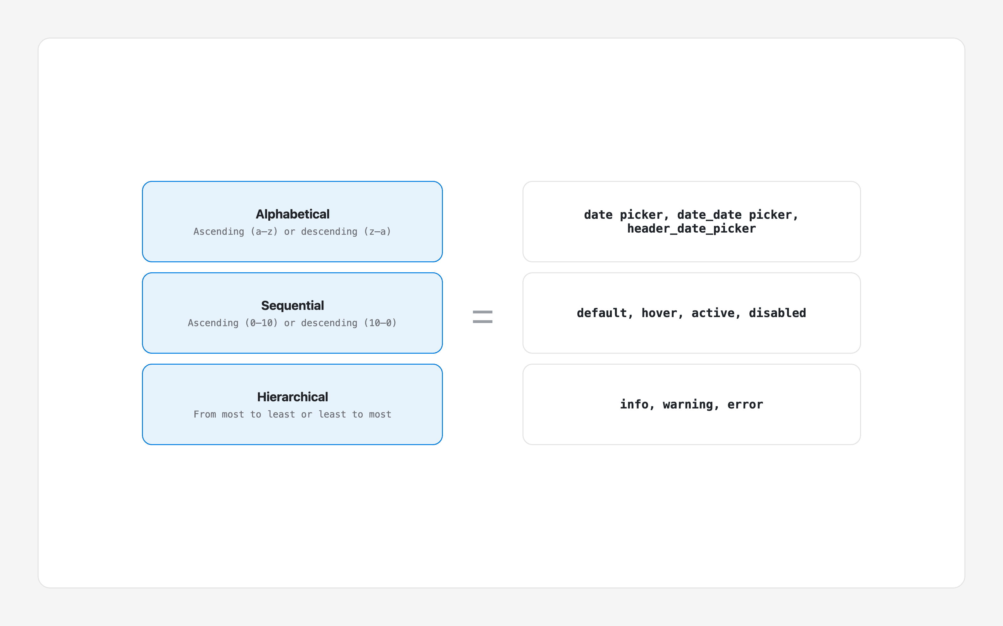
Choose an ordering system appropriate to each element:
Alphabetical: ascending or descending, for example bottom, left, right, top.
Sequential: ascending or descending, for example 1–6 or default, hover, active.
Hierarchical: from most to least, for example primary, secondary or info, warning, error.
5. Establish a taxonomic system
After these steps, apply the changes to your components. There are two possible paths.
Content audit
Audit every nomenclature already established across components, objects, properties, and values, with the aim of defining one taxonomic system with the design and development teams.
Creation of a taxonomic system
If you are starting a Design System from zero, or have completed the content audit, define the structure, grammar, and order for each element: component, object, property, and value.
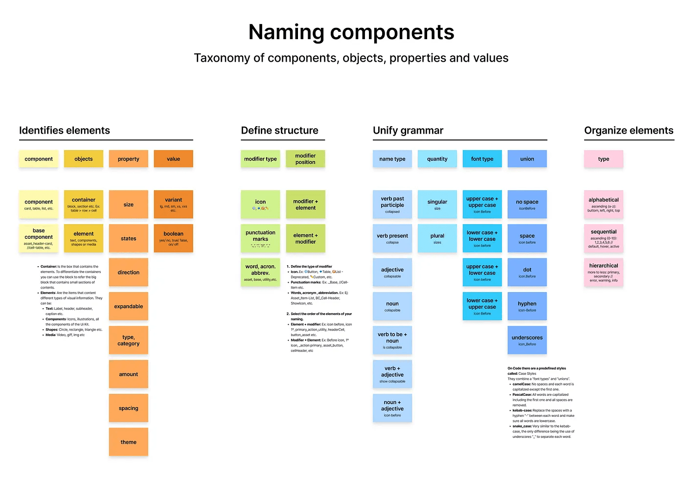
Download the free summary of this article in Figma Community
References
These nomenclature patterns were created from Design System documentation and its community of practice. References include Atlassian Design System, Polaris, Carbon, and Lightning Design System.